Monthly Archives: September 2012

Continuing the Gray Period: Stenciling the Office

So in the previous post, I dropped a little foreshadowing about an office stenciling project I took on, when I showed off my (sorry excuse for a)”mood board”.

I mentioned how some of the images in that board are screenshots, but a few are actual photographs … including the stenciled wall, which is something I just completed in our office.

But let me back up a bit …

After successfully jazzing up the formerly ugly brown hallway with some gray paint, I was inspired to paint the office (actually one of the bedrooms), as well. Somewhere recently I had picked up the tip about making a house feel connected with a cohesive color palette (actually, in fairness I probably heard that from my mom years ago but refused to heed the advice until I heard it on HGTV or somewhere else “reputable”). My former style had been more “I can paint this whatever I want? Holy cow, I need to pick a different outrageous color for each space!”, which in my 1900’s house (with small rooms) made everything feel even more chopped up than it already was.

Since you look directly into the office from the stairwell & hallway, I wanted to play off of the hall color and do another gray. “Gray?”, you are probably thinking, “That is so … dull”. And normally I would agree, but I’ve come to realize that I tend to gravitate towards a lot of brightly-colored accessories, so a bold wall color would just compete with that ….

Not that I have a problem with a color explosion:

Yes, that is an actual outfit that I wore. In public. But I digress…

So I knew I wanted another neutral gray. But I figured that I could go darker in the office since 1) it has two very large windows & a lot of natural light, and 2) the hall color was a little too light for me, anyway. At first I decided to go one color darker on the same swatch, since I “knew” it would match / go together (I don’t know if this is actually true, but I presume it is).

But just before I went off to Benjamin Moore to get the next-up-color (Rockport Grey, I believe), I happened across a section of BM’s website that lists “our favorite colors”. And one of their 5 picks for gray was “Cape May Cobblestone”. Since a) Alex & I got married in Cape May, and b) they described the color as “the perfect gray for small rooms”, I figured it was serendipity.

So, once again throwing discipline and research out of the window, I went ahead and got that color. And I knew it was going to be good when I ran into the previously-mentioned color-expert at BM, and I handed her my swatch, she announced “I like your gray. It’s the perfect neutral — has reds and yellows in it, so it plays well with others”. I breathed a sigh of relief, since I had gotten the expert seal of approval. Her expertise didn’t fail me — it really is an awesomely ideal gray.

But I’ve spent too long on explaining how I picked the color, and not enough on how (or why?) I did the stenciling.

I saw a few examples of stencils recently, and they grew on me …. it was a way to add a little interest or texture to a wall, but without the annoyance of wallpaper or anything difficult to apply & reverse. Many  places recommended Royal Design Studio as the place to get wall stencils, so I went for it. I got another stencil that I am in love with but haven’t figured out how to use yet … but the one I used for the office was the “Ribbon Lattice“. Why? Well… it seemed vanilla enough for a foray into stenciling — not too in-your-face, and (bonus!) not too complicated of a pattern, since this would be my first ever time stenciling.

Source: royaldesignstudio.com via Kelley on Pinterest

Then after some googling on how-to, I just went for it. No practice, no nothing — just straight onto the wall. Actually, I had to gather up some supplies first, then I got to work …

The biggest tip I can give is that when they say “dry brush”, they mean dry brush — you really want practically no paint on the brush (after dabbing in the paint, dab the brush on a paper towel to remove most of the paint). It makes for a much crisper line. It will feel like you’re not getting a thick enough coat on… but trust me, you are. It felt like I had only a chalky layer, but when I pulled the stencil off it looked great.

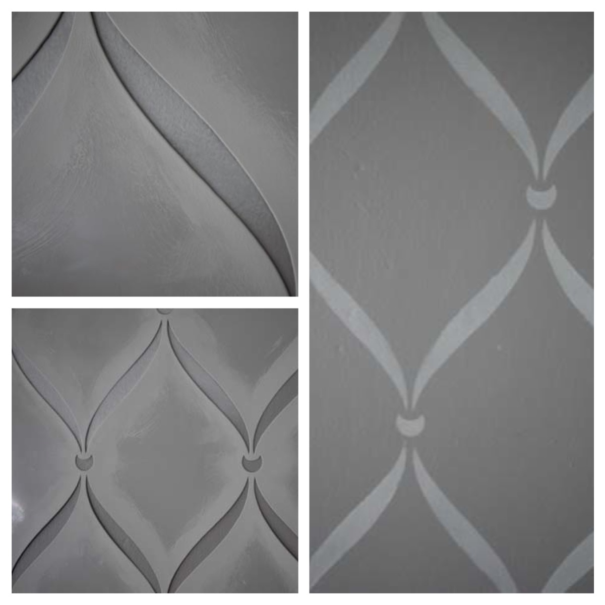
I used leftover “Moonshine” paint from my hallway project, partially since it was free, but also because I figured that would be a nice tie-in between the hallway and the office. (I did the stencil on the wall you can see from the hallway).

Because I’m lazy and a novice, I only did one wall, but I like it that way. It definitely adds a lot of pizzazz to the room.


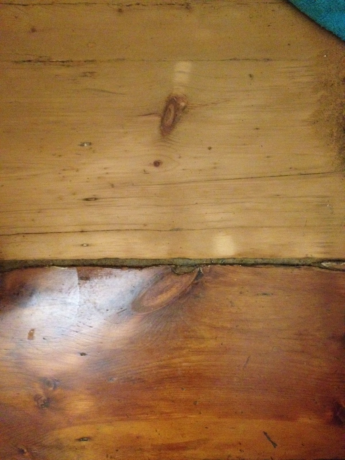
Even though that photo is very low-res (I shrunk it so it wouldn’t take too much time loading, but went a little overboard), you can probably still ID a to-be-tackled project — the baseboard. Since removing the wall-to-wall carpet & having the original 110+ year old floors refinished, we realized that the baseboard needed new quarter-round moulding to finish off the baseboard-to-floor gap. So more on that (annoying) project later …


Tagged , ,

Feeling Moody: Office Edition

In perusing various home improvement type blogs (or even wedding blogs, back when I was planning our wedding), I notice a lot of so-called “mood” boards, or inspiration boards. Some people do a really nice job of putting them together, so you can get on board (har! no pun intended) with their vision. But it’s not something I ever thought of doing myself. I just kept it all in the privacy of my own mind. I knew what my own vision was…. sort of. But when I started using Evernote (which I would describe as a cross between Dropbox and Pinterest) for wedding planning, and then eventually moved on to the (in?)famous Pinterest , I realized I was basically already making “mood boards”.

Here is my Pinterest board from my wedding planning:

*Note: the painting in the upper left is actually the one that I had done for my hubby’s groom gift, I pinned it to the board when the fabulous artist featured it on her Etsy store. 

And I didn’t realize that the PowerPoint presentations I was making to sell my husband on my vision for things were junior “mood boards” in their own right. For example, below is a presentation I created to convince him that we should buy these bookcases from Crate and Barrel and these desk file cabinets from CB2:

Not the my best work ever, but you get the idea. And, surprisingly, it worked — we headed to the CB2 store in NYC to pick up the office furniture that same weekend.

Here’s another slide I made for him (can you sense a theme of how I do my convincing? I was totally that kid who would whip out the poster board for a presentation to my parents on why we should get a dog .. or maybe it’s my MBA “everything must have a slide deck” mentality kicking in). This time I was trying to convince Alex that we should buy another CB2 chartreuse filing cabinet, and use the two to form a base for a homemade desk (because I went insane with jealousy & “I could totally do that”-itis when I saw the homemade 13-ft desk over at Young House Love).

If you’re paying attention to my slides, you’ll notice the office wall color changed between the last two — that’s because we’ve painted it. I’ll post an update about that (and my adventures in wall stenciling) later.

So now, here’s my most recent “mood board” for the office … ta-da! Some of them are actual photos (like the stenciled wall [foreshadowing!] and the desk/table), and some are screenshots of furniture we already bought for the room (such as the filing cabinet) or furniture we’re thinking of buying (the chair-and-a-half). And there are a few other accessories thrown in to liven it up.

I’ll post again once we have the office in a semi-complete state, so we can see how close I came to this vision … I guess it will be pretty good since I already own more than half of the stuff in that board. So…. sweet!

Tagged , , ,

The beginning of my Gray Period

Home-improvement activities tend to ebb and flow in this house. We’ll go from having a rush of ideas, to sitting idly by for 8 months at a time, only to get the bug again.

Recently, we got the bug again.

It started with our hallway. We have been talking about painting it since day one, because it’s been an unappealing shade of diarrhea brown (sorry for the disturbing visual, but it’s pretty accurate). We’ve changed a few of the colors the previous owner left for us, but mostly out of personal preference. This one, however was just a plain bad color (sorry if the previous owner happens to read this — but I stand by my statement!). While it wasn’t a ridiculously dark color, since the hall is completely internal to the house with no direct sunlight, we knew we wanted to lighten it up to make it feel airier. We figured gray would be a nice, neutral color. And, not wanting to repeat the same mistake of randomly picking a color from a piece of paper, ending up not liking it, and repainting a few months later, we decided that we’d actually do a few test swatches.

No amount of Lightroom editing can tone down the ugly color

One of the colors was just a little too dark, the other just not quite right. We looked at them for a few days and nights, and then because a calculated method for choosing the color just wasn’t my style, I flat out picked one off the internet (having already forgotten my resolution to not do just that).

One day while following link after link after link, I came across the fantastic DIY blog Young House Love. It is great, so if you haven’t read it, do so. While perusing some of their posts, I noticed they had an ideal soft light gray color in many of their rooms, including a hallway (hooray!), where they added a frame gallery (a setup I would later go on to blatantly rip off). So I told myself “Hey, Kelley, it looks awesome on the internet, so let’s just go for it”, and ran off to Benjamin Moore to get a gallon of their color (Moonshine) and get to work, completely disregarding my previous lesson about picking a color without testing it on your wall first. Alex was traveling for work for the whole week, so I went at it all by myself, doing a few hours of work each night once I got home.

I decided to use the sprayer rather than the traditional roller / brush method, because I naively thought it would be faster.

Let’s have a little sidebar about roller / brush vs. sprayer:

We got the paint sprayer a while ago (the most basic model from Lowe’s) because 1) I am always looking for a shortcut, and 2) I am a very sloppy painter. So in my mind, the sprayer would 1) help me go faster, and 2) force me to tape off some more so I don’t end up splashing paint everywhere. A word to the wise: it doesn’t really make a whole paint job go much faster. As far as I can see, the biggest benefit of using the sprayer is that the in-the-moment painting is faster, and it dries more quickly (since you end up applying very thin coats), allowing you to recoat sooner. But what you save in paint-application time you pay back in prep work. So while it’s got some advantages, I wouldn’t make a blanket statement saying it’s overall faster or easier than the traditional roller / brush method.

Back to the paint job. In a room like our hallway, without any uninterrupted walls (it is, after all, a hallway, so there are 6 doorframes and two stairwells to consider), the sprayer was a bad choice. It took me almost 4 hours just to tape everything off. I also went very slowly, because I was taping off our ceiling, and even on a ladder, my 5’2″ self couldn’t easily reach the top of our 9′ ceilings. So that was a pain.

Once everything was taped off, it looked a bit like a scene from Dexter in there — this photo shows all of the tape & newspaper, but it was before I put plastic dropcloths everywhere (I ended up hanging one from the sloped ceiling above the stairwell, to protect the stairs, so there was a giant plastic curtain).

But then I did my primer, and things were already looking better. Two coats of paint (and three nights) later, I finally pulled off the tape to reveal our much-improved hallway.

So, full disclosure: while I initially was in love with it, and patted myself on the back for picking something off the internet, I have since come to realize that it’s just a little too light and blue / silvery for this particular space. However, I like it about a million times more than the previous color, and the almost blue undertones don’t bother me enough to repaint it (no way, no how). Plus, I rationalized that the blue-ish tones (I’m probably completely inaccurately describing this, because I’m a color n00b) probably tie nicely into the blue-gray of the bedroom color. Probably. I figure a new coat of crisp white trim paint (the current trim is already white, but in dire need of repainting) will really help the gray pop (plus, as I previously hinted, I went on to fill up one of those walls with white frames, just like in my inspiration, so that helped, too).

Before & After

It’s making me crazy that the before & after pictures are at slightly different angles with a slightly different tone – so I’m sorry about that. Also the before picture is marred by the test-swatches, but that’s just because it really wasn’t worth photographing before. Also, while up on the ladder taping, I realized one of the bulbs in the fixture was burnt out (which I still haven’t replaced), so it’s a little dimmer than it would usually be. Hopefully, though, you can fully appreciate how much better it looks, even with my poor photography skills.

And of course this transformation kicked off what I’ll call my “gray period” ….(<— that’s foreshadowing)

Tagged , ,

Painting the Bedroom (Again)

So I previously alluded that I wasn’t too happy with the wall color in our “master” bedroom. Sure, it was lighter than the original navy blue, but it always felt too “baby blue” for my tastes. We put darker accents in the room (dark gray quilt, curtains, etc), but it never stopped feeling like we were sleeping in a cloud (which, I suppose, isn’t the worst feeling you could get in a bedroom).

Not the best photo, but you get the gist. This was before we had a bed frame or, for that matter, any other furniture.

At the end of the day, it just wasn’t what we had in mind. But it’s worth it to point out — we couldn’t properly express what we had in mind. Or at least I couldn’t… perhaps Alex was envisioning something totally different. The best explanation I could come up with was “bluey-gray or gray-blue”, but that wasn’t really cutting it, because there are many, many colors that could fit that description.

Then one day we were at Ikea, and noticed that one of the example rooms had a great gray-blue color on the walls. Thinking “why mess with success?”, we wrote down the color and planned on heading directly to the nearest Benjamin Moore store to get it.

I don’t remember the name of the color we intended on buying, but we didn’t end up getting that one.

See, our local Benjamin Moore store has an in-house designer / “color expert” on staff who gives out advice at specific times during the week. As luck would have it, she was in when we came to pick up our would-be-new-bedroom-color. At the time, we didn’t feel like we were lucky — we just came in to buy a color, no questions asked, and instead we got ambushed with a million and one questions, and a 2-hr long lesson on color theory. My head was swimming while I heard such nonsensical (to me) things as “mmm…. that’s a lot of pigment”, “you young people want a really bold color, but don’t know what you’re looking for”, “this blue color doesn’t actually have any blue in it”, “just because it looks one way in one room doesn’t mean it will look the same in another room”, and “this has reds and yellows in it, so it’s a perfect neutral and plays nice with other colors” ……. Uhhh, what???

It was really an overwhelming experience … but eventually, the designer (who shall remain nameless, since I don’t know if saying we were “ambushed” counts as libel), dropped a little tidbit that she had been the designer for the local eco-salon Lux. Alex and I both love that place, not just for the fabulous haircuts (we both go there), but because the renovated historic building is just gorgeous. So we went from “we’ve got to get out of here and never come back” to begrudgingly agreeing to give her “put these large swatches up first” system a try.

And in the end, we decided on BM’s Province Blue (#2135-40). It was the perfect blue-gray shade I had been envisioning — a lot “darker” (I don’t even know if I’m using the right color-language) than the blue we originally got, but without feeling heavier (if that’s even an appropriate description).

I cannot express how happy I am with this new shade. It is absolutely perfect. The room feels calming, sophisticated, but not overbearing. While I am always anxious about running into this designer-lady in the store whenever I pick up paint, I can’t deny that she steered us towards the absolute perfect color for our room.

Ignore the sloppy ceiling-paint (we’ll eventually be adding crown moulding to class it up a bit)

From left to right: Too-pale and just right

The photos above are definitely making it appear more green than it actually is (the ones below are more true, but still not perfect)  — so you’ll just have to take my word on it: it’s the perfect bluish-gray color for a bedroom. Once we brought in the gray curtains, and wrought-iron bed frame, then lightened it up with an off-white quilt and night stands, the room is a great relaxing sanctuary (with a way-too-big-for-the-room king sized bed … but my commitment to scale does not extend past my comfort, so the king bed stays, no matter how cartoonish it looks).

To top it off, we finally got a frame for the bed (oooh! I feel so grown up), and with some spruced up Ikea bedside tables (which I painted with Annie Sloan chalk paint & roughed up a bit), I’d say we’ve got a pretty nice looking bedroom (it’s making me crazy that I didn’t think to make the curtains even before I snapped this shot — ahh, OCD!)

Ooooh! Ahhhh! (Yes, the bed is way too huge for the room. But I will not negotiate on this). If I do say so myself, those hardwood floors are lookin’ goooooood. Refinishing them was such a good idea. And ignore the canvas that is just leaned on top of the headboard — I wanted to see how it looked in that spot before hanging it (and I think the verdict is: looks good).

Here’s another shot that makes the room look a little bigger than it really is (and also shows off my “I’m just going to put this here, on top of the air filter” method of clothing storage). Thank you, wide-angle lens!

There’s still a good amount of decor that needs to be done in there (two giant bare walls aren’t my idea of stylish), and we’re almost certainly going to add some crown moulding, but for now I’d say the new paint color goes a long way towards making the room better looking.

Tagged , ,

You're a wizard, Kelley!

Yesssss, that was a Harry Potter reference. Hopefully you’ll understand why in a bit.

To set the stage, here is our house, from the front:

So charming, no?

We’d known for a while that we wanted to paint the front door of our house, but we’ve been waffling for a year on what color. Originally (before we even found / bought the house), we were convinced we wanted the (stereo?)typical red door. But after taping a few red swatches to the front door, we weren’t sold on it. It was just too… normal.

Then we were thinking of either a cobalt blue (fabulous! plus it would be an indication that “the blue cars live at this house”, at least in our book) or a sunny yellow. But we weren’t really sure which would look best.

Eventually we made our way to Lowe’s, and picked out a few blue and yellow swatches. Then, thinking about the rest of our house (the black shutters, white trim, and pale butter-yellow painted brick) we dared to ask the question:

“Yes, these are fabulous options, but what color would actually go with our house?”

This was beyond our expertise, so we consulted the experts — we googled color theory. Yes, we did. We figured the pale yellow covers the most area, so we went with that as our base color to match. And the internet told us that we needed to pick a color right next to ours (another yellow), or directly across the color wheel. Lo and behold …. that opposite color was purple. So we thought, “why not?” and picked up a few purple swatches.

After a few days of watching the swatches on the door, we just went with it and picked a purple shade, because, frankly, it was the most awesome.

Purple!

We then removed the door hardware, and haphazardly attempted to fix the broken seal around the window … it didn’t really work, but we gave up, figuring we’ll be replacing the door eventually, anyway (add that to the long list of things to get around to). Then we painted. And painted. And painted. I don’t know if it’s a purple thing, or a dark-color thing, but it took at least 4 coats to look legit. And we had our front door open the whole time, since we couldn’t close it without messing up the wet paint. But in the end it was worth it.


Before & After. Ignore the dated tarnished-gold hardware — I’ve since painted it an Oil-Rubbed-Bronze (although sadly I didn’t take pictures of this; just take my word for it — it looks way better)

So undoubtably you’ve made it this far into the post, only to wonder “Ok, nice door…. but I still don’t get the connection to Harry Potter?”.

First, purple. That’s wizardly, right? But second, the curtain that hangs in the doorway is all covered in stars (it was there when we moved in, as an homage to the Bethlehem Star, so we just left it) … so when you’re all up on the door …

Purple door, star curtain
Showing off my sweet new hairdo (& lipstick) and my sweet purple door at the same time!


Tagged , ,

You’re a wizard, Kelley!

Yesssss, that was a Harry Potter reference. Hopefully you’ll understand why in a bit.

To set the stage, here is our house, from the front:

So charming, no?

We’d known for a while that we wanted to paint the front door of our house, but we’ve been waffling for a year on what color. Originally (before we even found / bought the house), we were convinced we wanted the (stereo?)typical red door. But after taping a few red swatches to the front door, we weren’t sold on it. It was just too… normal.

Then we were thinking of either a cobalt blue (fabulous! plus it would be an indication that “the blue cars live at this house”, at least in our book) or a sunny yellow. But we weren’t really sure which would look best.

Eventually we made our way to Lowe’s, and picked out a few blue and yellow swatches. Then, thinking about the rest of our house (the black shutters, white trim, and pale butter-yellow painted brick) we dared to ask the question:

“Yes, these are fabulous options, but what color would actually go with our house?”

This was beyond our expertise, so we consulted the experts — we googled color theory. Yes, we did. We figured the pale yellow covers the most area, so we went with that as our base color to match. And the internet told us that we needed to pick a color right next to ours (another yellow), or directly across the color wheel. Lo and behold …. that opposite color was purple. So we thought, “why not?” and picked up a few purple swatches.

After a few days of watching the swatches on the door, we just went with it and picked a purple shade, because, frankly, it was the most awesome.

Purple!

We then removed the door hardware, and haphazardly attempted to fix the broken seal around the window … it didn’t really work, but we gave up, figuring we’ll be replacing the door eventually, anyway (add that to the long list of things to get around to). Then we painted. And painted. And painted. I don’t know if it’s a purple thing, or a dark-color thing, but it took at least 4 coats to look legit. And we had our front door open the whole time, since we couldn’t close it without messing up the wet paint. But in the end it was worth it.


Before & After. Ignore the dated tarnished-gold hardware — I’ve since painted it an Oil-Rubbed-Bronze (although sadly I didn’t take pictures of this; just take my word for it — it looks way better)

So undoubtably you’ve made it this far into the post, only to wonder “Ok, nice door…. but I still don’t get the connection to Harry Potter?”.

First, purple. That’s wizardly, right? But second, the curtain that hangs in the doorway is all covered in stars (it was there when we moved in, as an homage to the Bethlehem Star, so we just left it) … so when you’re all up on the door …

Purple door, star curtain
Showing off my sweet new hairdo (& lipstick) and my sweet purple door at the same time!


Tagged , ,

Hallelujah! It's hardwood floor time.

Getting married really put a damper on our home-improving. Mostly because of the time. Oh yeah, and the money. We were definitely strapped for cash.

But after the dust settled (and we were officially Mr. & Mrs.), we had enough cash left over for a project we had been really, really, really wanting to do ….

Remember these babies?
When we pulled out the wall-to-wall carpet on the second floor, we were thrilled to find out that the original 17-inch planks were still there, and in great shape. We were less thrilled that they were painted brown. Now, don’t get me wrong — in the grand scheme of things, it could have been way worse. They could have been destroyed and damaged, or painted a less-palatable color. So we were able to put up with the brown paint for about a year. But the floors were getting more knicked up by the day (the paint isn’t so great as a protectant), and our patience with the unfinished look was wearing thin.
We had previously gotten a too-good-to-refuse quote on refinishing them from the same guys that refinished our living room floor (TJ Hardwood Floors — we definitely recommend them for quality, reasonably-priced work). While it wasn’t cheap, the economies-of-scale made it more manageable (cheaper to do all of them at once than one at a time). Add the good price to the cost of my time and lack of expertise in refinishing hardwood floors, and we were definitely going to pay someone to do it for us.
The first step was moving all of the furniture around, after strategizing which rooms we’d tackle first (knowing we’d have to keep those rooms empty for about a week while the polyurethane cured, before swapping again for round two). That was a huge pain. But we got it done.
Next, TJ & his team got to work sanding. Which took allllllll day long. Really, I can’t complain, because I just went off to work while Alex worked at home to watch. But out of 8 hours in a day, approximately 7.5 went to sanding, while the final 0.5 was for sealing.
Sanding, in progress… there were many, many layers of paint.
Then there was more sanding. And more. And more. Also, some hammering (they did a few repairs along the way, but not many, especially considering we’re talking about 112-year-old floors). And finally, it came to sealing! Here’s where the magic happens.
Left: After sanding
Right: After one round of polyurethane 
(as you can see it still needs more sanding & topcoats)
Sidebar: why did we go with no stain, and traditional (oil-based) polyurethane? Well…. we really wanted that rich, caramel color that comes from traditional polyurethane over bare wood. We definitely were more interested in water-based (no-VOC) polys (for environmental reasons, but also for smell — we stayed in a hotel one night the vapors were so bad), and we even did some color tests (see picture below). But you don’t get any yellowing with water-based. Which usually is a good thing (why would you want yellowing?), however when it came to getting the richness of color, oil-based was the way to go. In hindsight, perhaps we could have gone with a stain followed by water-based poly, but we feel like the floors ended up beautiful, so for now we’re happy with the choice.
Top: Bare wood with water-based sealer (Bona Waterbased Polyurethane)
Bottom: Bare wood with traditional oil-based polyurethane
See how the traditional oil-based polyurethane brings out more of the wood’s character? While we surely could have figured out a better way to use the water-based poly and get the same color, we thought this was the way to go.
In the end, we think our floors look fabulous! There are still plenty of imperfections (weird cutouts where we haven’t quite figured out the original point, more than a few knots, etc), but we love them that way.
Love them!
Tagged , , , ,

Hallelujah! It’s hardwood floor time.

Getting married really put a damper on our home-improving. Mostly because of the time. Oh yeah, and the money. We were definitely strapped for cash.

But after the dust settled (and we were officially Mr. & Mrs.), we had enough cash left over for a project we had been really, really, really wanting to do ….

Remember these babies?
When we pulled out the wall-to-wall carpet on the second floor, we were thrilled to find out that the original 17-inch planks were still there, and in great shape. We were less thrilled that they were painted brown. Now, don’t get me wrong — in the grand scheme of things, it could have been way worse. They could have been destroyed and damaged, or painted a less-palatable color. So we were able to put up with the brown paint for about a year. But the floors were getting more knicked up by the day (the paint isn’t so great as a protectant), and our patience with the unfinished look was wearing thin.
We had previously gotten a too-good-to-refuse quote on refinishing them from the same guys that refinished our living room floor (TJ Hardwood Floors — we definitely recommend them for quality, reasonably-priced work). While it wasn’t cheap, the economies-of-scale made it more manageable (cheaper to do all of them at once than one at a time). Add the good price to the cost of my time and lack of expertise in refinishing hardwood floors, and we were definitely going to pay someone to do it for us.
The first step was moving all of the furniture around, after strategizing which rooms we’d tackle first (knowing we’d have to keep those rooms empty for about a week while the polyurethane cured, before swapping again for round two). That was a huge pain. But we got it done.
Next, TJ & his team got to work sanding. Which took allllllll day long. Really, I can’t complain, because I just went off to work while Alex worked at home to watch. But out of 8 hours in a day, approximately 7.5 went to sanding, while the final 0.5 was for sealing.
Sanding, in progress… there were many, many layers of paint.
Then there was more sanding. And more. And more. Also, some hammering (they did a few repairs along the way, but not many, especially considering we’re talking about 112-year-old floors). And finally, it came to sealing! Here’s where the magic happens.
Left: After sanding
Right: After one round of polyurethane 
(as you can see it still needs more sanding & topcoats)
Sidebar: why did we go with no stain, and traditional (oil-based) polyurethane? Well…. we really wanted that rich, caramel color that comes from traditional polyurethane over bare wood. We definitely were more interested in water-based (no-VOC) polys (for environmental reasons, but also for smell — we stayed in a hotel one night the vapors were so bad), and we even did some color tests (see picture below). But you don’t get any yellowing with water-based. Which usually is a good thing (why would you want yellowing?), however when it came to getting the richness of color, oil-based was the way to go. In hindsight, perhaps we could have gone with a stain followed by water-based poly, but we feel like the floors ended up beautiful, so for now we’re happy with the choice.
Top: Bare wood with water-based sealer (Bona Waterbased Polyurethane)
Bottom: Bare wood with traditional oil-based polyurethane
See how the traditional oil-based polyurethane brings out more of the wood’s character? While we surely could have figured out a better way to use the water-based poly and get the same color, we thought this was the way to go.
In the end, we think our floors look fabulous! There are still plenty of imperfections (weird cutouts where we haven’t quite figured out the original point, more than a few knots, etc), but we love them that way.
Love them!
Tagged , , , ,

Home Improvement Musings

Happy post-Labor Day! In honor of a big DIY/home-improvement-sale day (honoring economic contributions of workers roughly translates into sales at big-box home stores, right?), here are some random musings …

One of the best parts about being a homeowner is the endless possibilities!

We closed on our house a little over a year ago, and I can still remember walking through in our first few weeks and pointing out all of the amazing changes we were going to make — “We should tear out this horrible old concrete slab and put in a new patio!”, “Here’s where another bathroom would go” , “Ugh, we need to upgrade to a natural gas stove ASAP”, “This wall color has to go”, “I can’t wait to tear out these carpets!”, “Think about how fabulous this would look if we put up a new awning”, “I could totally build a bar/cabinet like that… we just need to get some tools” … and on, and on, and on.

The best part about our plans was how quickly they would be done (in our fantasyland). There was just no way I was going to let more than one winter pass without replacing the oil furnace with a natural gas one (BTW, we’ll soon be heading into our second winter without having done this). I was going to paint every. single. room. in the house before the moving truck even arrived (Uhh…. we painted one). About the only thing we did according to our original timeline was get the wall-to-wall carpet out before the furniture from our old apartment arrived, a few days later.

And that was really frustrating. I genuinely (and naively) thought that the house would be “finished” (if not perfect) within a few months. At most, a year, including some bigger projects.

Why didn’t it work out that way? Well…


Continue reading

Tagged , ,